Product news
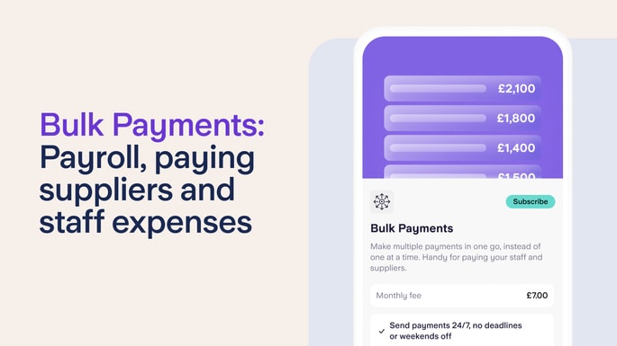
The Bulk Payments feature for limited companies
14th November 2025
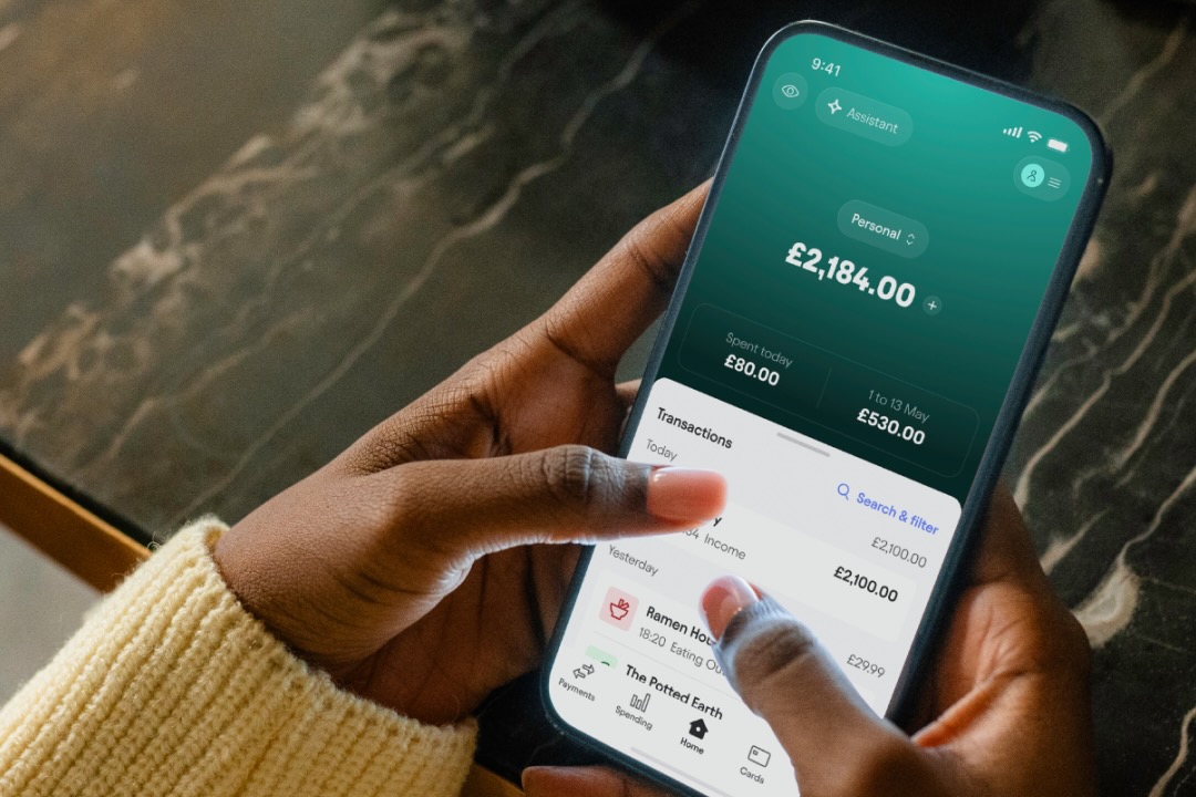
At Starling, we’re always working to make our app even better - both for personal and business accounts. Recent tweaks include displaying monthly spend as well as daily spend on the homescreen and updating the font on the Android app to match our website. These changes are small, but significant when it comes to producing a sleeker user experience, otherwise known as UX, for Starling customers.
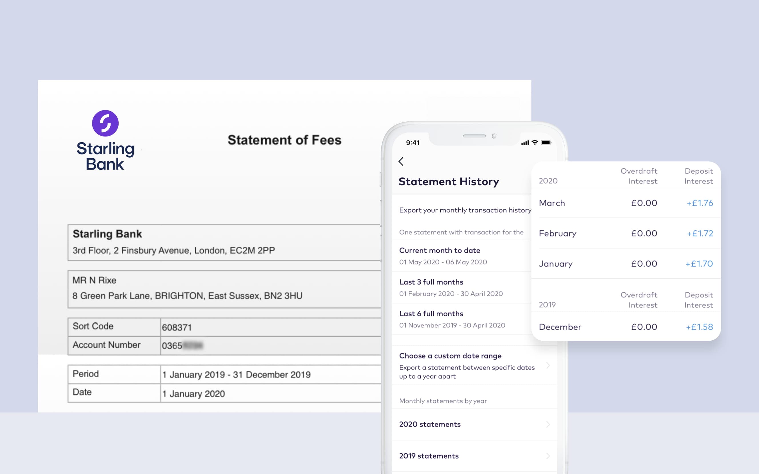
In our latest release, we’ve updated the way your Starling bank statements look. You can now see three types of statements: transaction history, interest earned from Starling and fees paid to Starling. We always strive to be transparent on any fees we charge around overdrafts or loans. Previously, the transaction history and interest statements were available in-app. The fees statement had to be requested from Customer Service. Now, all three are visible and accessible in-app.
When we decided to make multiple types of statements available in-app, our product team came up with four different ways to do so. Product Designer Nick Rice headed up the redesign and ran a user test to gather feedback and identify issues with the different design options. A user test involves sending a prototype version of the app to various users, not necessarily Starling customers, keen to test and respond to the designs.
The option that we’ve gone for was the easiest to navigate - a clean, simple design to help you find information without too many clicks. Statement months are now grouped into years, as well as being displayed by the current month to date, the last three full months and the last six full months, helping you quickly access the statement you need.
When you look through your transaction history, the other change you might notice is that we now include notifications for when your card was declined. This can happen if you lock your card or if you have insufficient funds. Remember that if you’ve moved all your money into Goals (where you can set money aside for specific items), your card could be declined if there’s not enough in your main balance to cover the payment.
And speaking of Goals, we’ve been making some changes there too. When we launched the Connected card, we updated the design of Spaces, including Goals. The total amount that you’ve set aside is now calculated and displayed at the top, encouraging you to keep saving as you watch that number grow.
Product news
14th November 2025
Product news
6th June 2023
Product news
5th June 2023
Money Truths
22nd April 2026

Business
27th March 2026
Money Masters
17th March 2026