Product news
Helping economic abuse survivors with our new feature, ‘Hide references’
6th June 2023
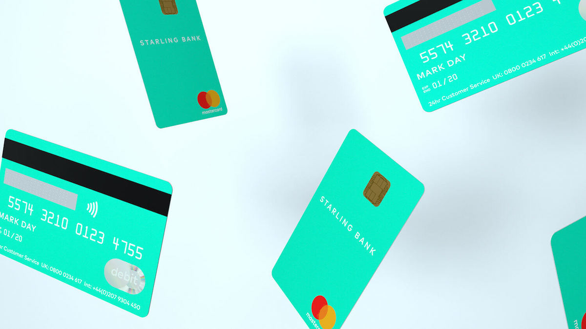
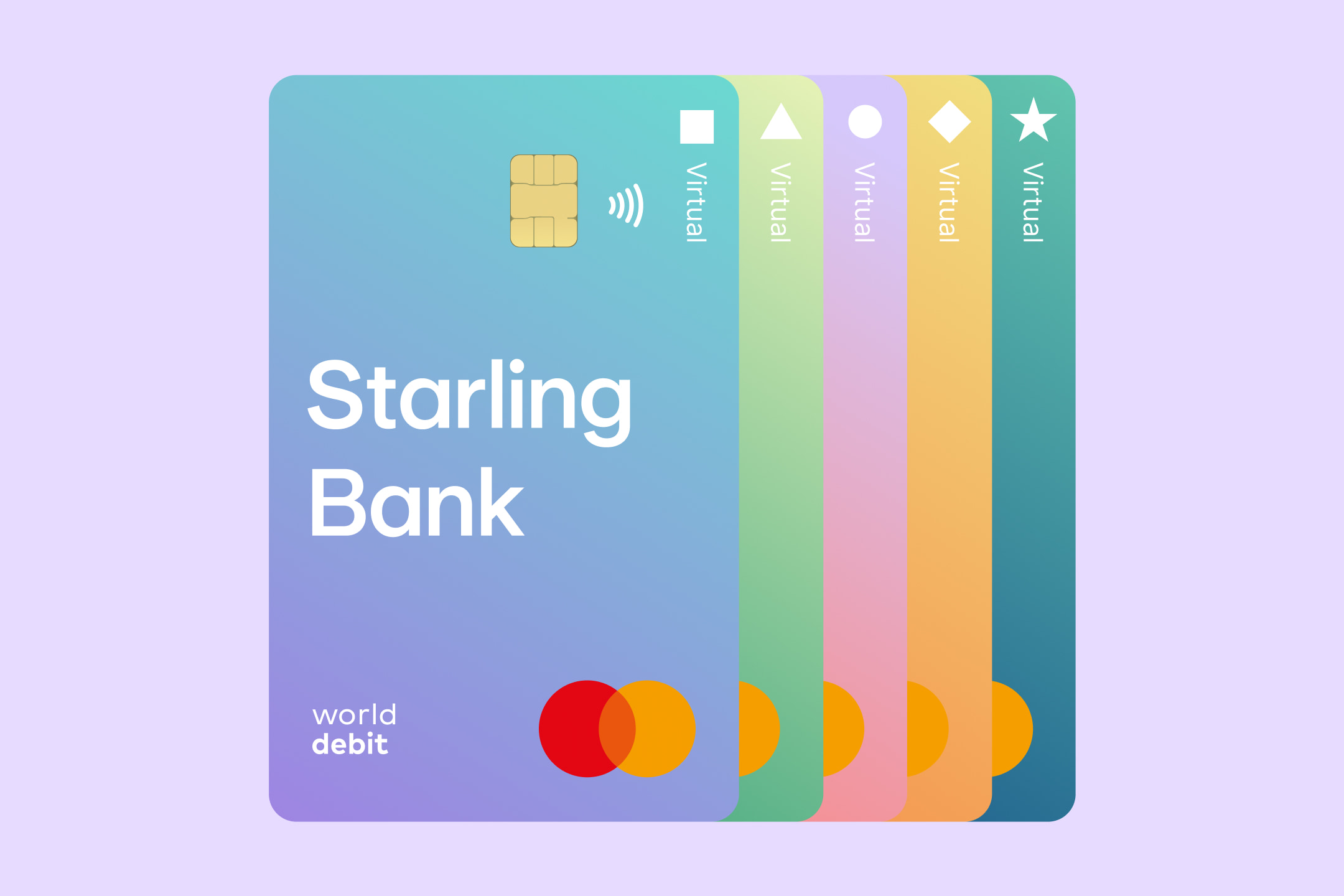
Here’s a look back at a proud moment in Starling history – an early redesign of our cards. We’ve had so many landmark moments since 2018, such as introducing recycled plastic for all our debit cards, but we thought we’d leave this post up as it’s such a key moment in our story.
Good design is about more than the way things look. It’s about challenging old methods and responding to cultural shifts. Adapting the outdated to meet new ways of living.
We built a new kind of bank from scratch because it was clear that traditional banking didn’t really fit into the way we live anymore, and that it only still existed because no-one had got round to changing it yet.
And it’s that spirit – questioning old logic, then finding a way that works better – that we’ve brought to the redesign of our new debit card. We decided that we wanted to do everything in-house rather than outsource it, and then once we started the process, we realised that we first needed to understand why bank cards look the way they do.
Design usually evolves to solve something or to meet new needs, and bank cards don’t look the way they do by accident. They were designed landscape because of the way old card machines worked, and they’re embossed with raised numbers so they could be printed onto a sales voucher.
But we don’t use those machines anymore, so when you think about it, a landscape card is just a solution to a ‘problem’ that no longer exists. At Starling, we think it’s important that we can justify every decision we make – and we just couldn’t find a reason good enough to carry on using a design based on antiquated needs.
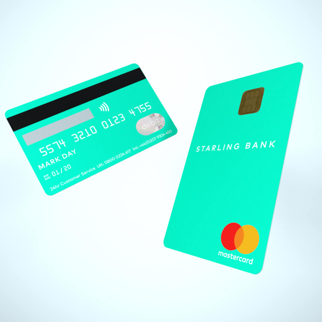
So we studied consumer behaviour. If people don’t interact with their bank cards in that way anymore, then how do they use them? The answer seemed obvious: in portrait.
From how you slot your card into an ATM or a card machine to how you tap it for contactless, our lives are largely lived in portrait now, even down to how we use our phones. A portrait bank card reflects how we actually use our cards today; it’s intuitive, instinctive, and in short: it’s just common sense.
By playing this video you agree to YouTube's use of cookies. This use may include analytics, personalisation and ads.
At Starling, we’re comfortable with doing things differently. It’s a common thread that runs through all the choices we’ve made so far, and broadly speaking, we’re the first to admit that we’re on a mission to transform every part of your banking experience and the industry in general.
When we’re designing the app, our approach is generally: how can we create something that fits effortlessly into – and improves – people’s everyday lives, and how can we do that in a way that hasn’t been done before? We approached redesigning our card the same way, and while we were determined to create something far more distinctive and memorable than our previous card, we also knew any changes had to reach beyond just making something beautiful. They also had to make sense.
And that’s important! We wanted our new card to feel sleek and simple, almost like a natural extension of our app, and we also wanted its appearance to somehow reflect our broader mission to streamline the complexities of traditional banking.
So we’ve stripped everything back and flipped all the card details to the back, in the process losing all that bumpy embossing and clutter and creating something that we think feels far more clean, refined and beautiful to use. Your user experience as a customer is really important to us, and we want every part of your Starling experience to feel consistent and delightful.
For the personal card, I chose an understated yet vibrant teal hue inspired by the iridescent blue-green tones of the Starling bird’s plumage. We’ve used this tone regularly throughout our app over the years, so we thought it made sense to recognise that aspect of our digital identity while still paying homage to what originally inspired us. We’ve also used a pearlescent finish, to give it a subtle but memorable shimmer and a smooth touchability.
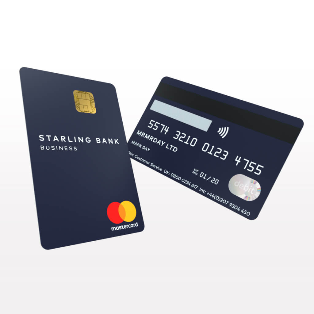
Then for our new Starling for business card, we’ve chosen a deep navy that feels decidedly professional with its inky shade and sleek, sophisticated finish.
We’re really excited about this new chapter of Starling’s story. We think the design of these new cards far better reflects the visual sensibilities of our brand, and more broadly, who we are and what we believe in.
We love our new design and we hope you do too.
Article updated: 23 Feb 2024
Product news
6th June 2023
Product news
5th June 2023
Business
3rd October 2022
Money Truths
2nd July 2025
Money Truths
1st July 2025
Money Truths
29th May 2025