How Much Does It Cost?
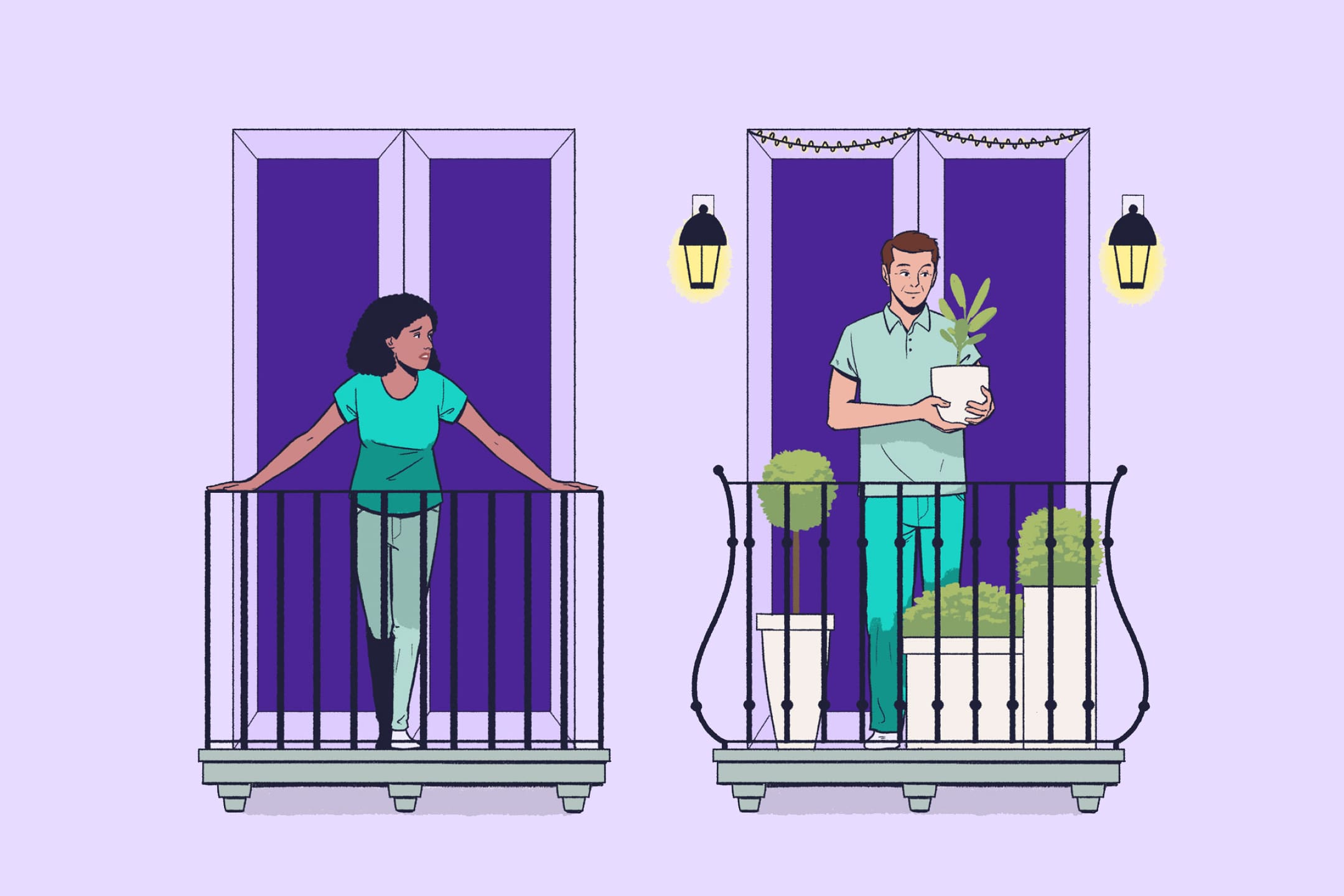
Boomerang generation: ‘How much rent should I charge my children?’
Takeaways, subscriptions, ‘the dad cab’ and… dating. This writer faces the facts: his twentysomething is now a fully grown, unexpected housemate.
By Paul Henderson